
Note №10
Language of Perception
22 February, 2025
Color and texture are deeply intertwined, and together they shape the way we experience sensations and emotional states.
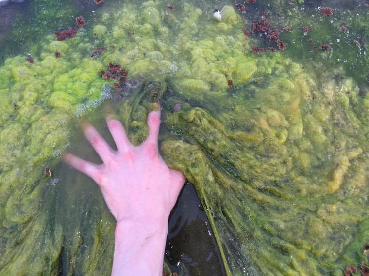
In the physical world, they often harmonize effortlessly. The shine of brown wood, for instance, communicates smoothness rather than matte roughness. It can create a sense of comfort and security, yet at the same time it may feel slightly artificial or detached.
There is no simple formula for this. Context shapes perception in subtle and unpredictable ways, yet patterns can still be observed. Blue tends to calm, while red draws attention and energy. People with naturally serene temperaments rarely gravitate toward red.
But what about in digital art? In film or virtual paintings, does color, texture, and sensation align on their own, or must the artist consciously orchestrate this harmony through insight and intention?
Could similar principles guide the representation of the psyche, across its many layers and depths?
Update
The number of colors is finite, which means the number of states and ways of representing them is also potentially finite.
